Browse these top design tips for a good design to ensure your design (whether it’s a website, logo, flier, whatever) is attractive, readable, and most importantly, effective. These design tips are straightforward and help whether you are trying to come up with your own concept or are evaluating one delivered to you from a designer.
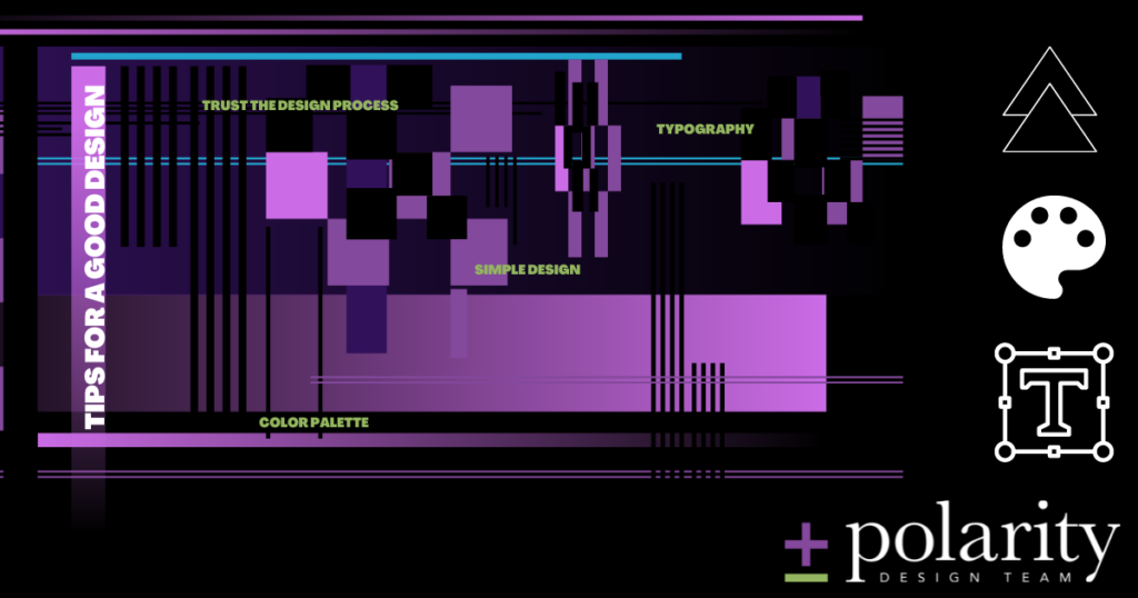
Design Tip #1: Keep It Simple
And by this we don’t mean boring or amateur. We mean your design should be concise, using only what’s important to your message and editing out the rest.
There’s nothing worse than an overwhelming design. When designs are too busy, they are hard to read. If your design is meant to bring in conversions, it needs to be understandable. If your design is neither readable nor understandable, there’s no trust built in you or your company, which is harmful to your success for obvious reasons. Tons of complicated lines on a logo, tons of text on a flier, or a thousand clashing colors are often used to make things “eye catching.” Unfortunately, they only serve to make a design an eyesore.
“Before you leave the house, look in the mirror and take one thing off,” advised the fashion icon Coco Chanel. This same advice can be used in any design to keep it clear, concise, and dare we say, classy?
Design Tip #2: Use a Simple Color Palette
Using color can be tricky. Color should be used to emphasize important things, and minimize the rest. If your design looks like 1980’s arcade carpet, it’s loud and overwhelming to the eye. Anyone old enough to remember knows that this (probably) isn’t the message you’re trying to send to your customers.
This design tip bleeds into the first in that a simple palette lends to your clean, concise design. As a general rule of thumb (though it’s hardly gospel), you can safely use three colors. This comes to two brand colors plus an accent color. Depending on the design, we may encourage a single color on a white background and black text to give your design a crisp, clean finish. Your designer can advise on the best approach for that particular project.
Hint: you don’t have to use all your company colors on every single design. You don’t even need them all in your logo.
Design Tip #3: Keep Your Typography Tight
Tight doesn’t mean “tiny,” “condensed,” or “not enough to give any information.” Tight simply means each word, font, and font size is chosen with intention.
There’s no reason to have more than two or three different fonts (or font sizes) on any single project. It leads to a busy design (see above design tips), but more importantly it loses all sense of visual hierarchy.
Large font sizes are often used for headlines to draw attention, with a smaller font for additional information. An accent font is used to call attention to details or “call-outs.” Well-utilized typography pulls the eye in a specific direction in a specific order to convey your message as you want it presented.
If everything is a large font or in a hard-to-read cursive, people tend to glass over, skim, and ultimately not absorb anything you’re trying to say. Not to mention, fonts can convey “shouting,” and your audience doesn’t want to be shouted at for the entirety of your message.
Think of it as your overly dramatic friend who makes a big deal out of everything. Eventually you stop taking that friend seriously. Why? Because if everything is important, nothing is.
Design Tip #4: Trust the Design Process
Every designer’s process is different, but they got into the business for a reason. Ideally, part of that reason is, “they know what they’re doing.”
It’s normal, natural, and expected to have revisions and re-dos on any given design. It’s normal for your end design to look nothing like the original concept. Conversely, it’s also normal for the end design to be almost identical to the first rendition after trying four or five other ideas.
So be patient, communicate clearly, and trust that process. As long as you’ve done your research and hired a reputable designer and you follow these rules of design, your end product will be beautiful and effective.
The Bottom Line
These design tips incorporate the basics of the elements of design. And with this blueprint, a good design is all but inevitable. If you’re ready to start the process on your own design, we’re always here.