Any design is only as good as it is readable—and that’s a universal rule. Whether it’s a billboard, flier, or logo, it needs to be crisp and easy to read.
Complex designs can be so pretty. All the lines, script-y fonts, intersecting angles. It’s pleasing to look at. We really do get it. But designs that land on the simpler side translate better to screen printing and embroidery. They look less cluttered on a business card or flier. It directs the eye through the information hierarchy more smoothly.
And, to our knowledge, no one credible has ever said that something has to be wild to be stunning. On the flip side, plenty of credible sources have advised that busy looks are not good looks. In fact, even Coco Chanel advised removing one accessory before going out. Why? Because simple design always wins.
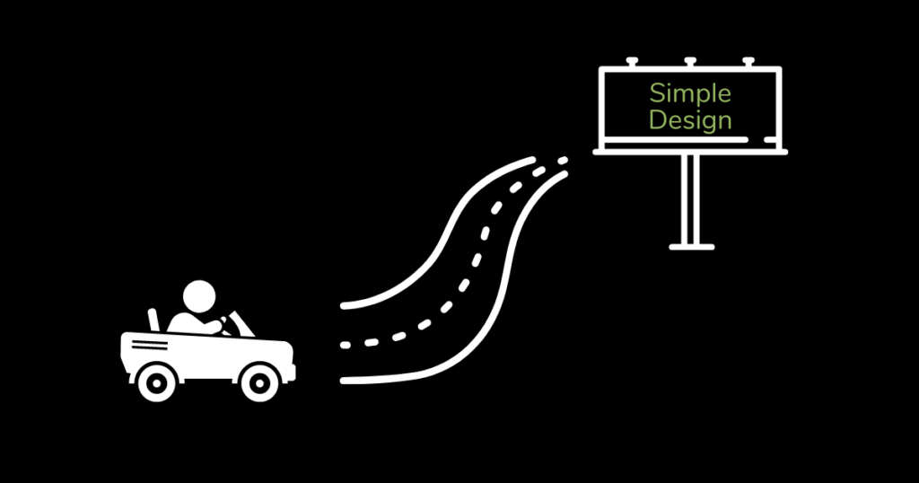
The Rule of the Drive By
We have a basic rule when it comes to everything we design. It’s unofficially referred to as the drive by rule, or we’ll just say something like, “Can you drive by it?”. The hypothetical of this rule is driving past a billboard on the freeway.
Billboards need big, bold, readable designs. Cars are driving past these signs going anywhere between 55 and 85 miles per hour, depending on the speed limit on the highway in your area. These people do not have time to take their eyes off the road for long enough to decipher a complicated image or large bodies of text. And even if they did, they’re zipping past it quickly enough that they don’t have a lot of time to read and interpret a complicated jumble of words and images.
A billboard needs to get to the point quickly. Big, clear logo or company name. Headline. Maybe a line of readable text. Beautiful image. The eye needs to be drawn to important information quickly and understand it within a second or two. Then it’s gone.
Readable Designs
Obviously a flier or brochure can have more than a logo, a headline, and one line of text, but the spirit of the rule still applies. The person reading it should be guided to the pertinent information quickly and be able to grasp the message in mere seconds.
Loud, competing colors, large bodies of text, difficult fonts, tech-speak, too many shapes, photos, or graphics. All of these lead to designs that are not readable. They may be eye-catching initially. But when it comes to trying to get them to actually absorb the information beyond that, you need to be smart about your designs.
A readable can design can still be eye-catching with well-thought out colors, fonts, and text, and also be decipherable to your customers. Honest conversations with your designers about your goals is invaluable for a design that is the best of both worlds.
The Anatomy of a Readable Design
Obviously there are a lot of ways for a design to be successful. Otherwise everything would look exactly the same. But there are a number of elements that should probably be present in most designs.
Headline: Your company name. The event (such as a grand opening). Whatever it is that this piece is highlighting should be the center of attention.
Image: Strictly text designs can be boring. Even business cards have a logo on them. This can be a photo, an infographic, a logo, or decorative designs.
Text: How much text you have is largely dependent on what you’re designing. A billboard should have one. A brochure can have quite a few.
Subheadings: Subheadings are how you break up lots of text. A brochure disseminating a lot of information needs to break that text up into subheadings for it to be readable. It doesn’t have to be listed out like your references in your end-of-term papers, though. Columns, squares, call-out boxes, etc. can all fall into the subheading category. These are not often used on billboards, but occasionally you’ll see a call-out box or similar.
Contact info: Website domains, phone numbers, or addresses are on most marketing materials. This allows people to reach out to you if they have questions beyond what is answered in their drive-by.
The Bottom Line
If your design doesn’t pass the drive-by test, it’s not readable enough to be effective. A simple, readable design can be just as eye-catching as a busy one while still achieving your goals. If you need help making your designs more readable, you know where to reach us.