
Your brand identity is composed of all visible elements of your brand—logo, color, design, etc. that identify and distinguish your brand in your audience’s mind. This is characterized by your company’s official font, specific color codes, and a consistent logo across platforms. Your brand identity also includes the language used in your marketing and company culture.
There’s also a lot that goes into it that is hard to define. Photography style (saturation levels, lighting/mood, warmth, etc.), the types of imagery you use (jewelry on a marble block or jewelry on a person?), the kind of verbiage you use (biker shorts or booty shorts), and the tone of language used (signing emails with sincerely vs. peace out).
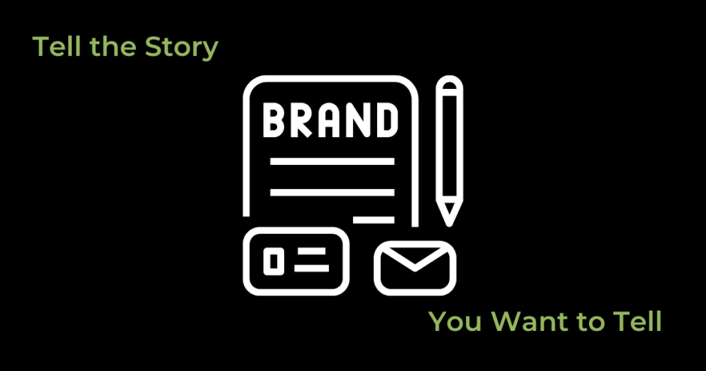
Your brand identity tells a story about you, your company, your values, and your quality, all without you ever saying a word.

The Brand Identity Struggle
This all sounds easy enough, but a lot of individuals have a hard time nailing down a branding guide. It’s easy to fall into the trap of liking too many things. You see one font you like and use it on your business cards. Then you see another font you like so you use it on the flier. Or you can decide your company colors are green and purple but don’t have the exact color codes for the green and purple you’re using. This can mean you’re using kelly green and royal purple on a flier, but a lime green and lilac purple on your logo. The general idea is the same, but the overall message is still confusing to the consumer. With every change, no matter how minor, the overall message you’re putting out there changes a bit. If there’s no consistency in messaging, there’s no credibility in your company.
Humans by nature are a little commitment phobic. The fear is always what if I choose this and find something I like better later?
The truth of the matter is, you may find something you like better later. You may stumble across another company you admire who has done things differently than you did. But the larger truth is that you’re not doing your company any favors by changing things every three months. An established, recognizable company is a company consumers find most trustworthy and legitimate. You need to be able to make a decision and be ok with that decision, regardless of any shiny new ideas that occur in the future. A marriage between yourself and your company’s brand is paramount to your success.
Our advice? Lean into and embrace the decisions you’ve made. Remember why you chose them to begin with, and move forward confidently.
Why Brand Identity is So Important
We’ve mentioned a couple of times that muddled messaging is confusing, and also that consistency lends to credibility. Let us expound on that.
Brand identity is a way to communicate who you are and what you’re about to consumers. A high-end suede-finish business card with raised UV laminate is going to send a different message than an embossed linen business card. This is not to say either of these options is “better.” This is just to point out that they’re different. One puts out a slick, professional, expensive feel. The other puts out a homespun, casual, though still high-quality, feel.
Writing your contact information in Comic Sans says your company is very laid-back and possibly juvenile (and that you probably made your business cards yourself). Writing your contact information in Arial says your company is very clean and put-together. A loopy, cursive-y font lends a feminine feel. Heavy block lettering may make you look like a construction company.
What we’re getting at is there’s a lot of nuance to creating your image. When that image is inconsistent across various platforms (Instagram, Facebook, your website, or even LinkedIn and printed materials like fliers), people have a hard time knowing what they should think of your company. If you don’t tell them what they should think through consistent messaging, their brain will settle on “unprofessional and illegitimate” at worst, and “amateur and forgettable” at best.
You Can Never Be Too Detailed
When we at Polarity get new clients and we ask about their branding, we often get vague answers. Words like clean, professional, and high-end. Or fun, organic, and dynamic. Our personal favorite is “just make it pop.” These are not the Google map directions you think they are to landing at a design that fits your brand.
“Make it pop” can mean 100 different things. Do you want it to literally pop with a 3D image? If so, do you want a drop shadow? Gradient? Layered images? Do you want a bright image on a neutral background? Do you want something outlandish and memorable? Help us out here.
A “clean, organic” logo can also go a lot of directions. Do you want it to look nature-inspired with flowy lines and earth toned colors? Or are you asking for clean lines, flat colors, and tons of negative space?
An idea of what your branding WANTS to say helps us put definitions to the words you’re using and we then design accordingly. Even better, giving us a branding guide of fonts, colors, tone, and style gives us step-by-directions to getting there.
What If I Need to Get Started But Don’t Have a Brand Identity Yet?
Hey, no worries. We get this more often than not, actually. A good designer can sit down with you and work out a couple of key starting points for your identity. They can even help you put together a branding guide for future projects. A reputable agency will have a basic understanding of how to execute what you’re trying to say, so if you’re not sure what you need, don’t be afraid to ask. We’re not here just to do what you say, we’re also here to help brainstorm and advise along the way. If you want to get started, we at Polarity will help you tell the story you want to tell.