
There’s so much more to choosing your final design than seeing a cool shape you love and running with it. At the same time, it’s also somehow not as complicated as people make it out to be. We’re going to provide a list of questions to ask yourself before choosing your final design. These questions will streamline the process while also ensuring your boxes are checked to help prevent a need to rebrand in the future.
The advice we’re giving will be specifically talking about logos, just to give it context, but these questions apply across multiple designs from your logo, to your website, to billboard design.
The Design Process
First it’s helpful to understand the design process, and imperative to know you don’t need to choose the first one sent over. Your designer should send you multiple concepts at a time. Some of these will be a slight variation of another, and others will be a completely different vibe. It’s rare that the first iteration of any one of these designs is your winner, so from here you’ll choose two or three that you like, provide feedback on what you’d like to see changed, and start the editing process. Usually it’s not until the third or fourth round of proofs that you find the new representation of your company.
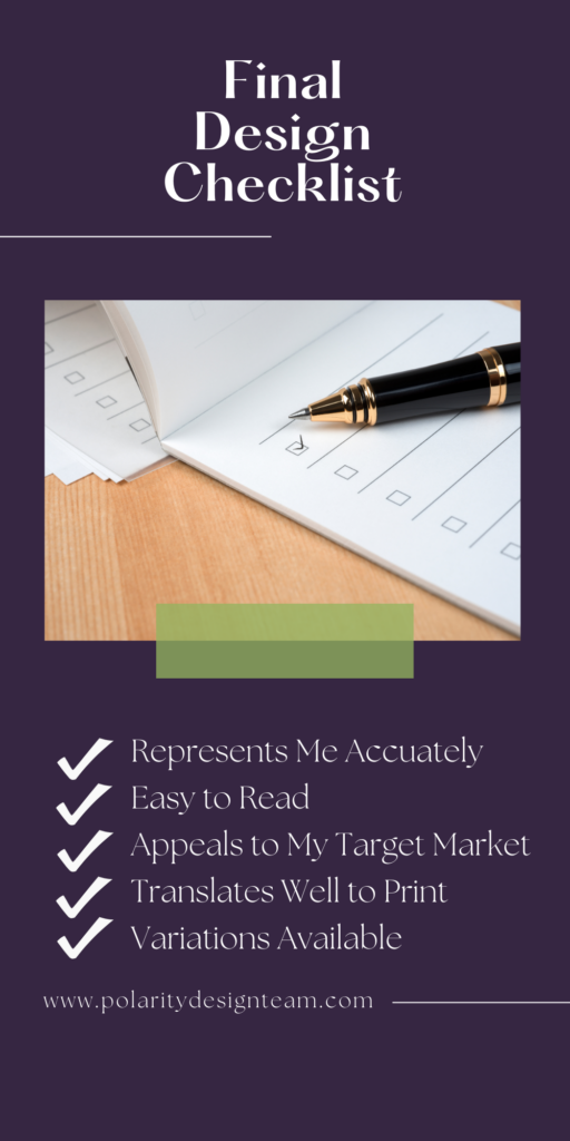
Questions to Ask Yourself Before Choosing a Final Design
These questions to ask yourself range from super simple (hello, do you like it?) to questions that may require a little more thought (will this translate well to screen print or embroidery?) But all of them are important to consider when committing to your final design.
Does This Design Represent Me/My Company Accurately?
When branding yourself and your company, there’s so much said that’s not in the text. Does your logo give off the right impression and correct vibes? You may not want something that can be interpreted as a closed fist (even if it’s not), for your florist company. It isn’t a great representation of what your company does or what it’s about.
Do These Colors Represent the Tone/Message Behind My Company?
To stick with our florist example, a hyper bold and aggressive black and red logo probably doesn’t represent the tone of your company unless you somehow specialize in hyper masculine arrangements for boxing matches.
Is This Design Feminine or Masculine? Does That Match My Brand?
We know society is moving toward a world where the words feminine and masculine don’t exist. We can’t wait for the days a construction company can be ‘feminine’ without being described that way or treated differently because of it.
However, we’re not there yet. People do interpret a lot about your company based on whether they perceive it as ‘girly,’ ‘manly,’ or ‘neutral.’ You probably want your floral company to range in the ‘girly’ to ‘neutral’ zone. Most people will still be confused by manly flowers. You don’t want to alienate them with a masculine design unless that’s specifically what you’re trying to do (see above boxing example).
Does This Design Appeal to My Target Market?
For obvious reasons, this ties in directly with the above questions. Hopefully you’ve designed your brand around speaking to your target audience. If your design matches your brand image and message, it should, in theory, appeal to the target audience as well. This question is a great check and balance to make sure you haven’t made too many allowances away from your overall message.
Is My Final Design Readable, or Does it Just Look Cool?
You can read about our Drive By Test here to judge whether or not your design is readable. No matter how cool it looks, your design is ultimately only as good as it is readable. Unfortunately everyone’s lives are too busy to see a design they don’t understand, remember it, and look into what it’s all about once they get home. That is, if they even know what to Google once they get home, depending on just how unreadable it was. In a world of overstimulation and constant marketing, your design will be background noise to almost everyone who isn’t your target audience. Don’t fall to the wayside because the people you’re trying to reach can’t understand your message.
Will My Design Translate Well to Screen Print and Embroidery?
Lots of thin, complicated lines, gradients, tiny text. These are just a couple of things that don’t translate well to screen print or embroidery. Even if you don’t need it right away, there’s a good chance that you’ll look into branded items such as apparel, cups, or pens eventually. Give yourself room to grow by preemptively giving yourself a final design that will translate well to these items.
Will This Work on Social Media and Your Website?
A long, skinny logo will not fit in the circular profile photo of your social media accounts. If you are able to make it fit, it will be tiny and unreadable (never a great branding strategy). A stumpy square design may not look great on the header of your website. Long empty spaces are best filled with longer designs. The good news is, you can resolve this question by addressing the below question.

Are You Able to Make Variations That Make Sense for Your Business?
Your core logo can be long and skinny and fit for a header if you have a smaller icon variation that will work for social media. Most logo packages will include these variations. If yours doesn’t, be sure to ask about it!
Do People Like It?
Obviously you should love the final design. But there have been many design-fails were loved by the individual and then forever mocked on the internet. Most of these come from phallic-y or otherwise suggestive designs that weren’t caught before production. Be sure to ask your friends, employees, and family what they think. Someone you know will be quick with a, “That looks like (whichever genitalia),” or, “That looks like (insert undesirable thing here).” If they love you enough, they may even be brave enough to say, “I just don’t like it.”
While you can’t please everyone, and shouldn’t waste your time and energy trying to, it’s important that the majority of people don’t hate it. Or at the very least, they shouldn’t be able to see anything blatantly offensive about it.
The Final Design Bottom Line
There are a number of things to consider when choosing your final design. However, it doesn’t need to be a weeks-long process of hemming and hawing if you simply ask yourself these questions and honestly answer them. Plus, if you need help or need guidance on all things branding, you know where to find us!